"Stories flow like rivers" in the background of the new logo.
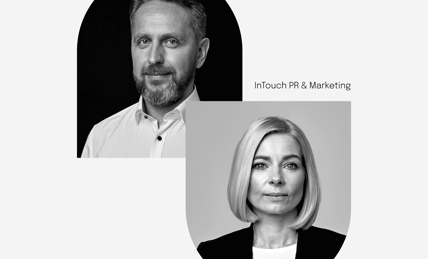
In touch is a phrase that has many meanings for Kamila and Hubert from InTouch PR & Marketing. They are in touch with each other (they are a couple) and in touch with clients, whom they help to be in touch with the outside world. Together, we decided that after years of operating with the previous logo, they were ready to push the element of typography into the background and continue working with the sign symbolically representing the name of their company - thus giving more space for their personal brands. For InTouch I designed a logo and a small intouchpr.pl website.

Old and new logo.

Kamila and Hubert in touch.
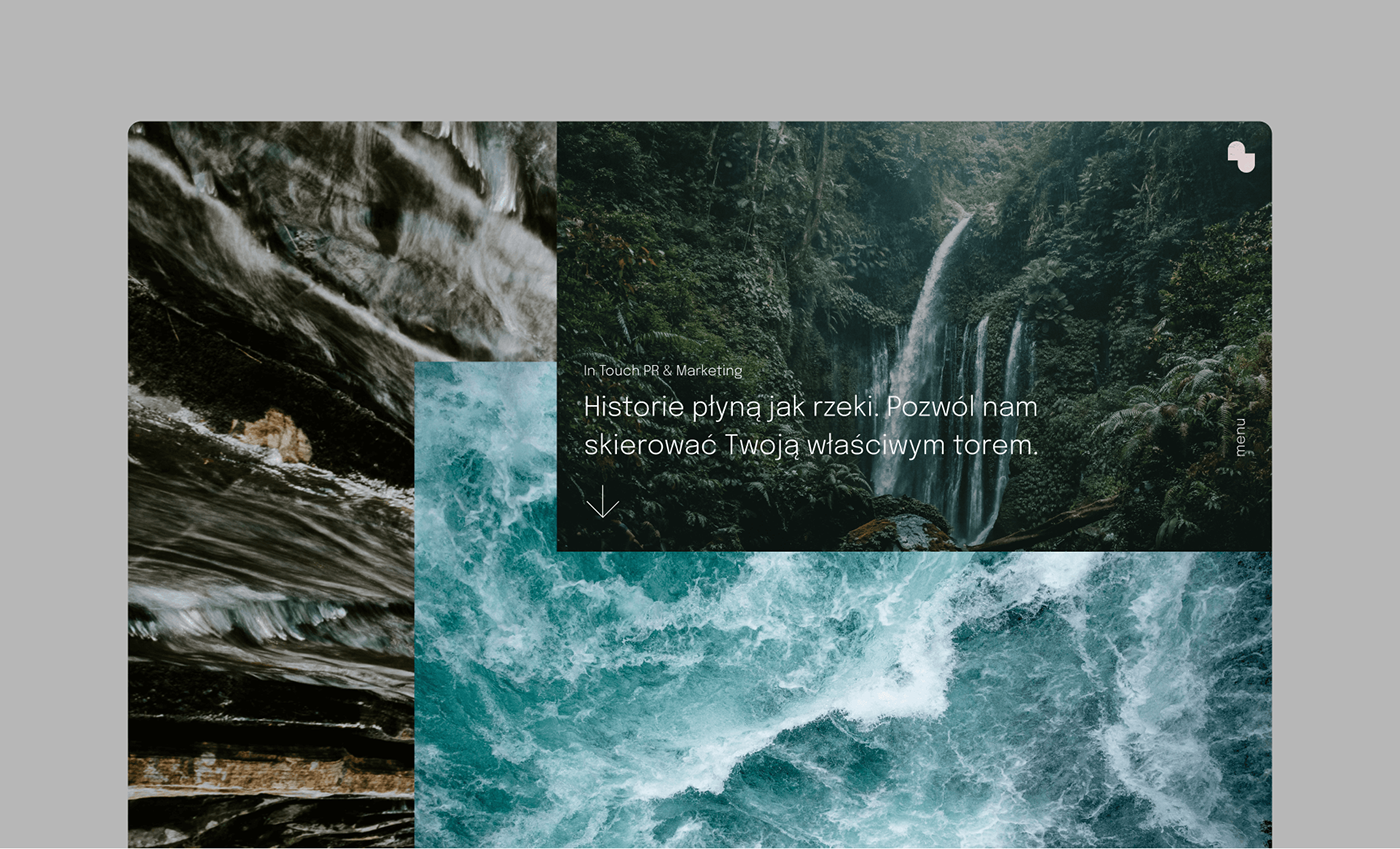
Introduction to a new narrative.
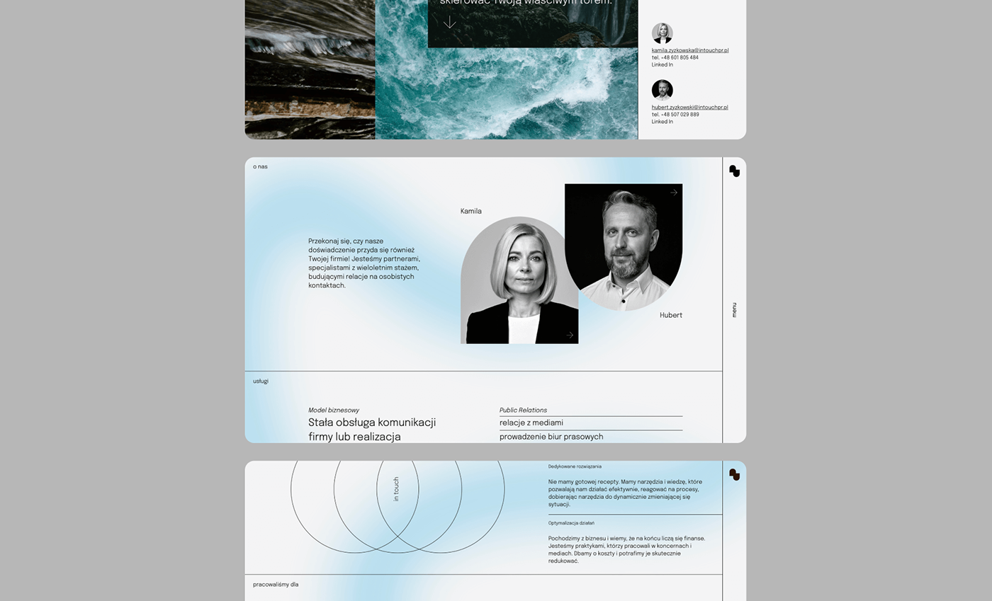
Responsive website – desktop version.
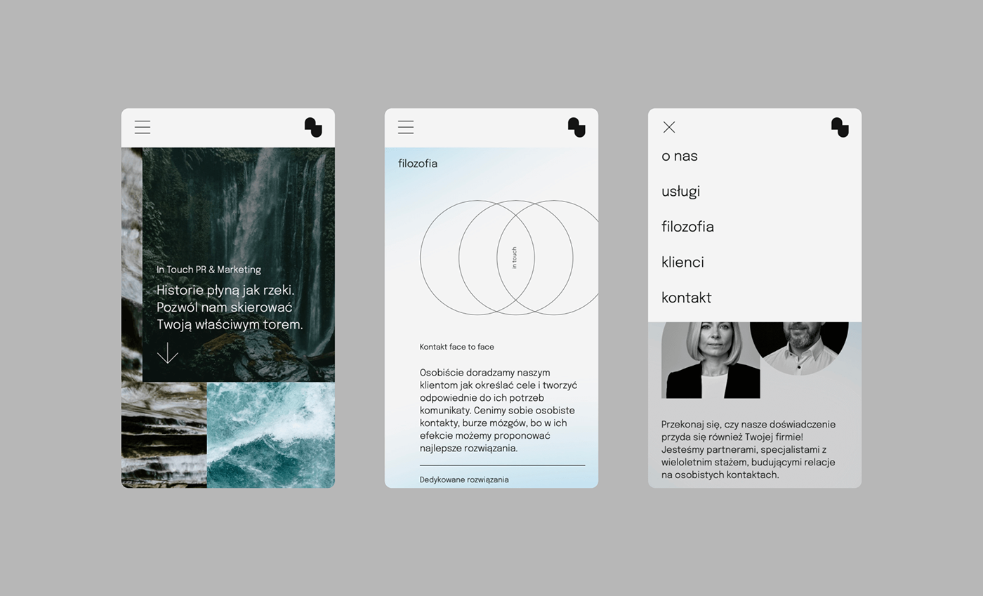
Responsive website – mobile version.